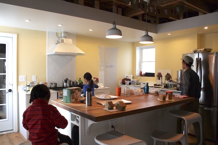
A common theme among our friends who build their own houses (or gut remuddle them in our case) is this magical point of good enough. Diehards and perfectionists excepted, many of us get to the stage where our house is functional and we declare it “good enough,” and move on to other pressing projects.
The house is then frozen in said state for the next ten, twenty years. As the owners, we’ll perfectly happy, but every time we walk by that spot, we might think, “Oh, I should really finish that trim.” But we won’t, until it’s time to move. Then it’s a mad dash to finish house, declutter, and decorate it. And right before our lovely home passes on to the next owner, we’ll look around and say, “Now why didn’t we get around to doing that last 10%? This looks great, but we don’t get to enjoy it!” Not that I’m projecting or anything…ahem.
Well folks, we’ve reached that point in our kitchen remodel. That door to the pantry will be cut in the spring. Someday, kitchen shelves and a windowsill will be made. Not now, though. Now it’s time to appreciate this beautiful space and its evolution.
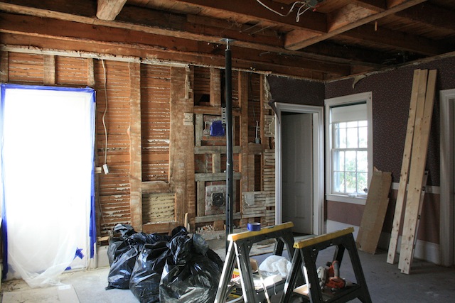
Kitchen before.
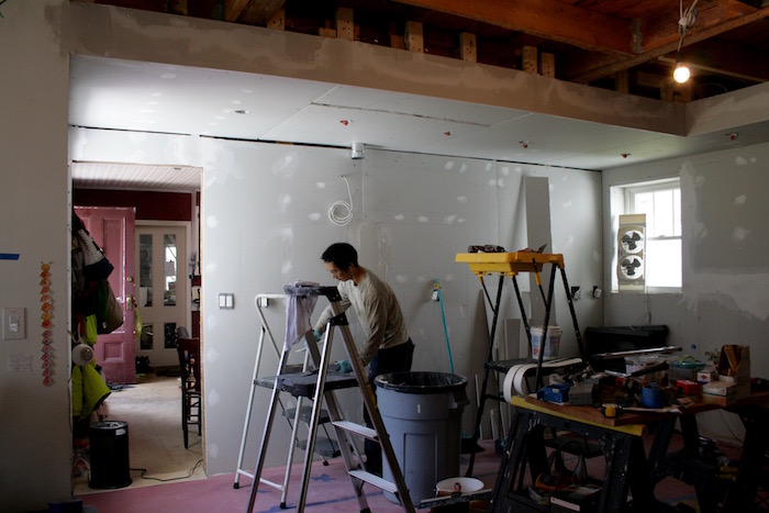

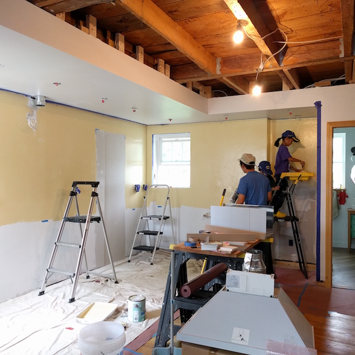
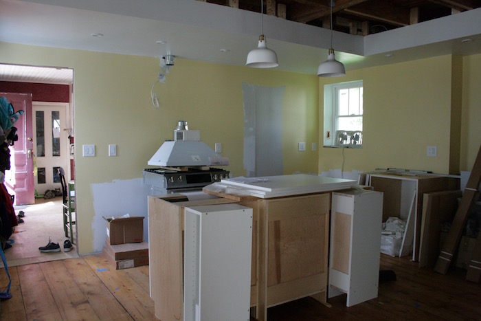
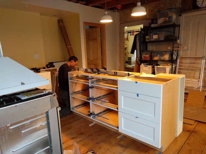
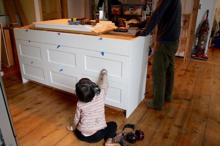

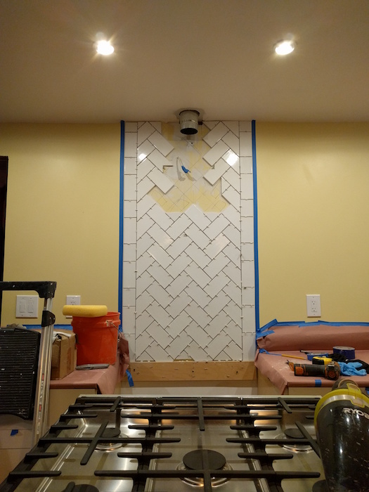
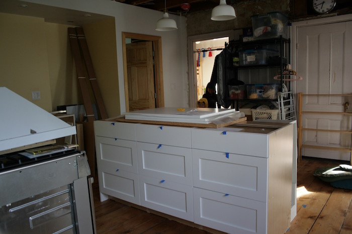

Kitchen after
Some notes about the space I don’t want to forget:
The walls are Sherwin Williams Harmony (no-VOC) paintline color-matched to Colorhouse palette’s Beeswax .01. It’s a lovely warm color, like…beeswax. The kids helped us prime and paint the walls, which was an exciting and sometimes hair-raising event in itself.
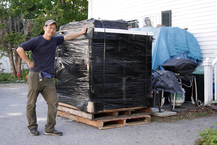
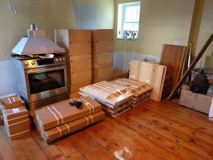
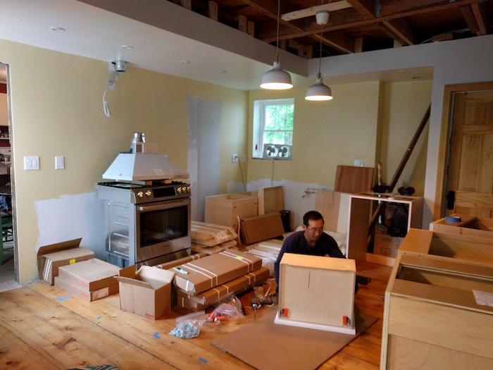
Cabinets were from Barker Cabinets, a company based in Oregon. We liked their plywood box construction, solid fronts, dovetail drawers and soft-closing hardware. The cabinets were manufactured in Oregon, flat-packed (except the drawers, which are pre-assembled) and shipped to us on a pallet.
Countertops were Geos recycled glass surface in Cirrus, measured and cut by a contractor. Apparently, my head was still in the Stone Ages; I was expecting someone to come and make paper templates. Instead the guy showed up with lasers and a laptop and proceeded to make CAD drawings for our review–welcome to the Digital Age!
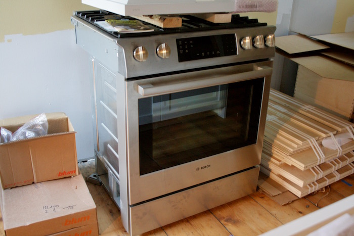
We switched over to a propane stove which Tig got used from Craigslist. Between the stove and the exhaust fan, I’m over the moon. The power, the flame!
The tile backsplash behind the stove is remnant tile we bought from a contractor friend for $20 or less. The brand is Iron Gate, and it’s been discontinued, but the tiles are nice quality. Tig came up with a gorgeous pattern that he knew I would like.
One of my favorite concepts of architect Sarah Susanka’s Not so Big House design that we used here is varied ceiling heights to define space. The dropped ceiling in our kitchen not only hides electrical wires and exhaust fan ducting, but also helps to frame the space (design geek moment).
Lastly, but not least, the best thing about this kitchen is the french door that closes off the icy-cold ell where our old kitchen used to be. The old kitchen where my feet would freeze and when I opened a drawer in the wintertime, the thermometer inside would read 40 degrees. All that is in the distant past now.
Our house now feels warm and cozy, and that’s good enough.
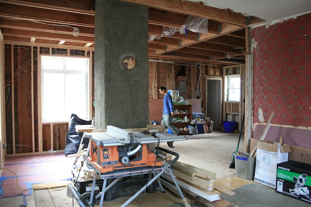
Before: view from living room
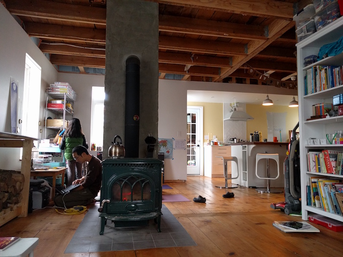
After: view from living room

Hi Serena – I happened upon your bookmarked website after months of not checking it — WOW! Enjoy every minute.
All the best,
Nan Doyle
Thanks Nan, what a nice surprise to hear from you.