Many years ago, I really enjoyed drawing by hand. When it was time to redesign our personal website and to bring in Liveaboard Dreams, I was happy to have the opportunity to put pen to paper again.
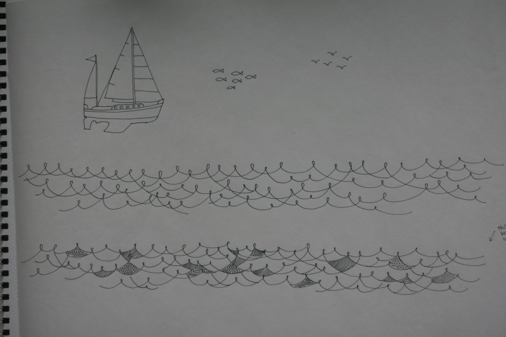
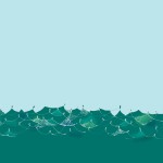
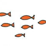
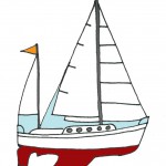
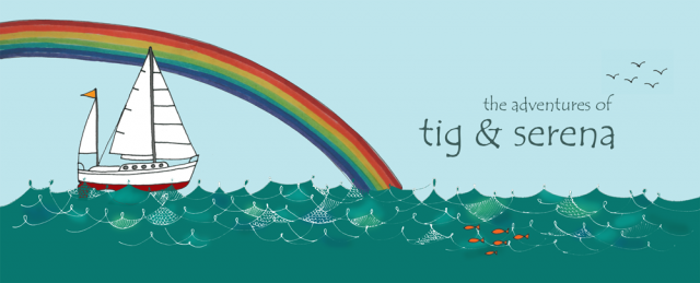
I had an idea of how I wanted the header image to be composed, but I wanted the flexibility to arrange the different elements, so I drew each component separately. Tig helped me take a picture of the drawing (above).
The picture of the drawing was then imported into PhotoShop, where I broke it into individual pieces and removed the grayish background that was the paper. I also drew a rainbow separately with colored markers.
Next came the fun part of coloring each drawing in, before piecing the header together. Each element lived in a different layer in PhotoShop, so that they could be moved around until I felt the composition was optimal.
Then I added lettering and cropped it to the header dimensions that I needed. I showed it to Kim, my friend and graphic designer extraordinaire who advised me to tone the rainbow down a little bit. After that, I was pretty happy with it and said to Tig, “Load ‘er up!”

Looks absolutely wonderful!!!!
Wow it’s beautiful! I am so excited for you all and your new adventure (and all that swag!) Savor it.
Thank you. I continue to draw (no pun intended) inspiration from you!